This post may contain affiliate links, and we may earn a small commission when you click on the links at no additional cost to you.
The warm, inviting tones of terracotta have captured the hearts of modern couples, bringing an earthy sophistication to wedding stationery. This rich, natural hue offers a perfect balance of warmth and refinement that works beautifully across all seasons. Here’s your guide to incorporating this timeless color into your wedding suite.
1. Signature Script
Terracotta ink brings unexpected warmth to traditional calligraphy, creating an intimate and inviting feel. The earthy pigment adds character to each stroke, making every letter feel both grounded and elegant. When executed on cream or white paper, the script takes on an almost sun-baked quality, reminiscent of Mediterranean aesthetics. The varying opacity of terracotta ink creates a beautiful dimension, with thicker strokes showing deeper clay tones while lighter strokes reveal subtle warmth.
2. Minimalist Script
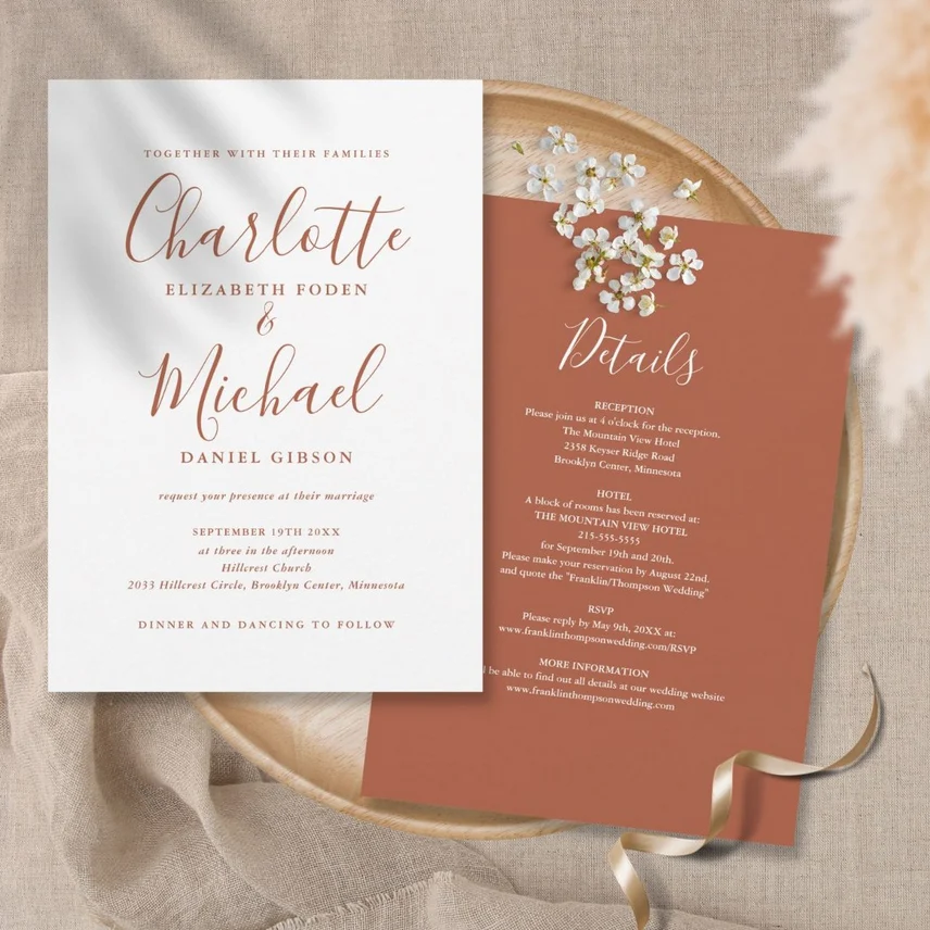
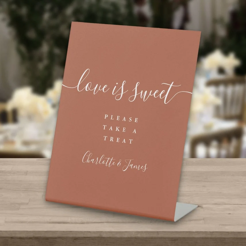
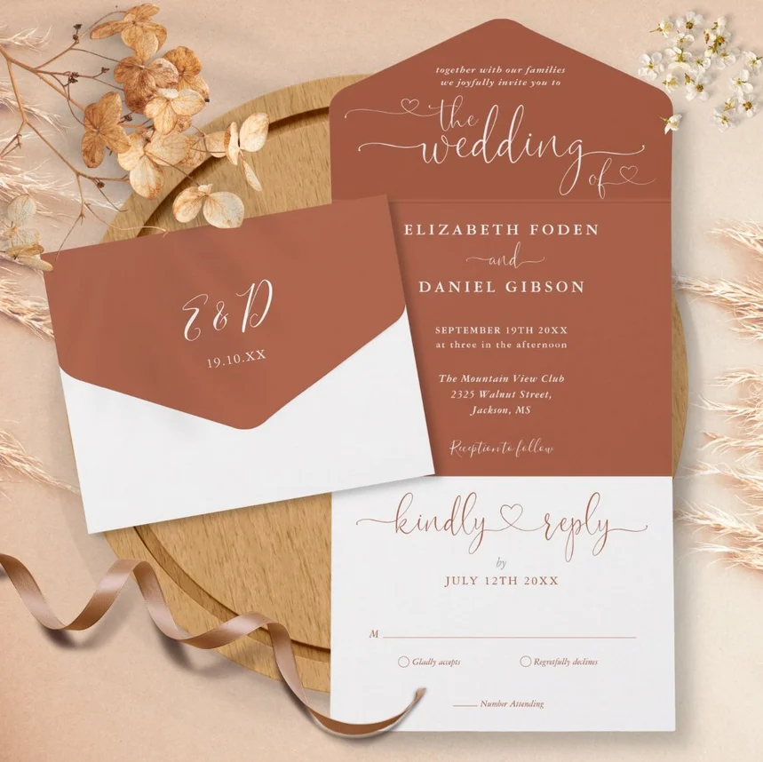
Clean, contemporary lettering in white or cream takes on a sophisticated air against terracotta paper. The simplified letterforms appear crisp and modern, while the warm background adds depth and character. This style particularly shines when the minimalist approach allows the natural beauty of the terracotta paper to play a starring role in the design.
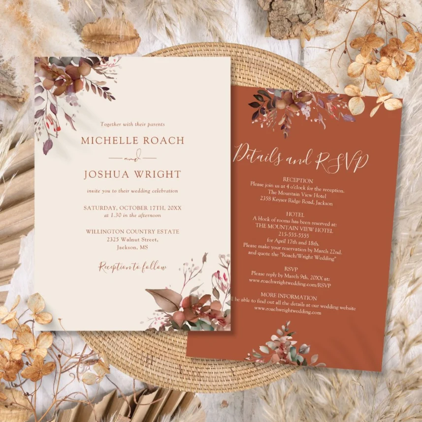
3. Natural Greenery Elements
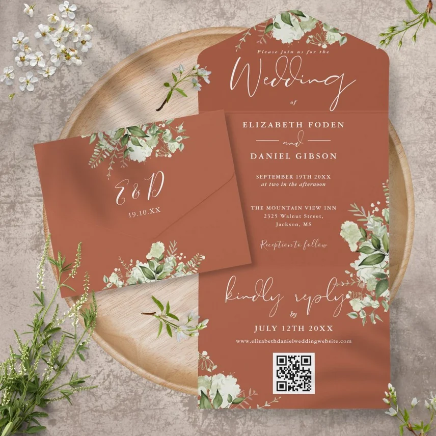
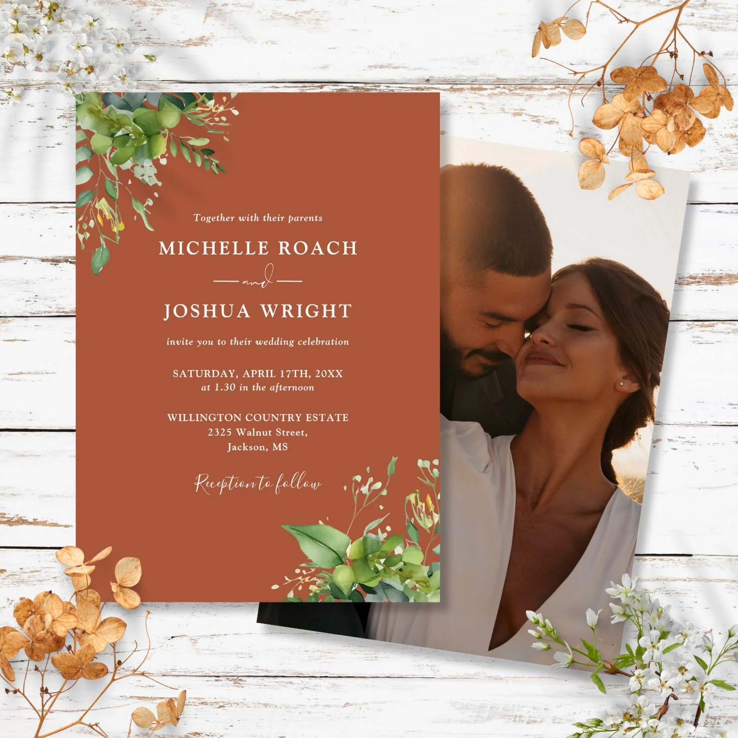
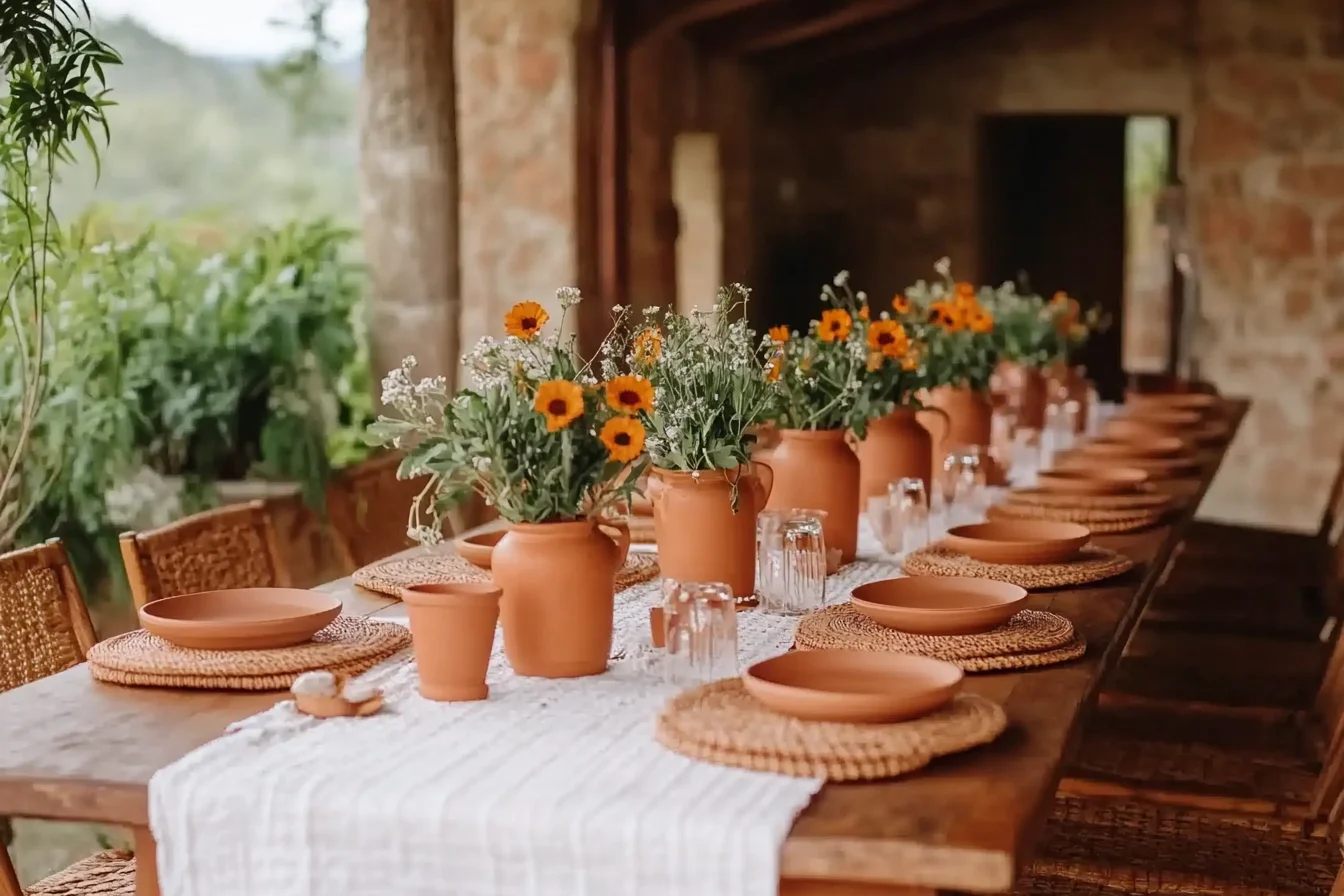
Fresh and dried botanicals pair beautifully with terracotta elements, creating a harmonious blend of nature’s palette. Olive branches, eucalyptus sprigs, and pampas grass complement the warm tones perfectly, while dried florals like strawflowers and lunaria add texture and dimension. These natural elements can be incorporated both as actual pressed botanicals and as illustrated elements, creating a rich, multi-layered design that celebrates the organic beauty of both color and texture.
4. Chinoiserie Elements
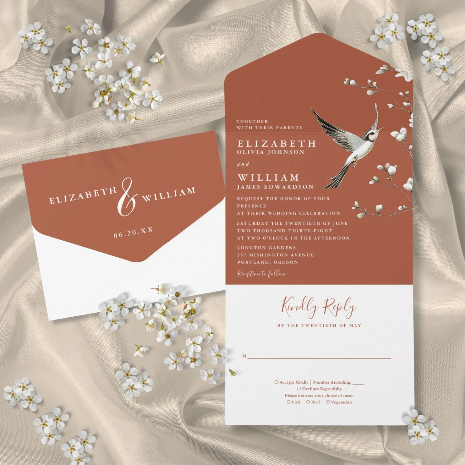
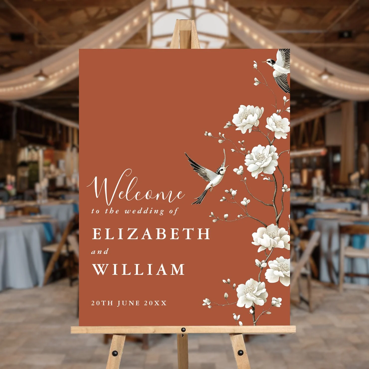
White or metallic chinoiserie patterns appear especially elegant against the terracotta background. Traditional motifs of birds, pagodas, and delicate florals take on new life against the warm paper, creating a beautiful fusion of Eastern artistry and earthy sophistication. The rich background makes every detailed pattern stand out while maintaining a cohesive, grounded feel.
5. Custom Monogram Artistry
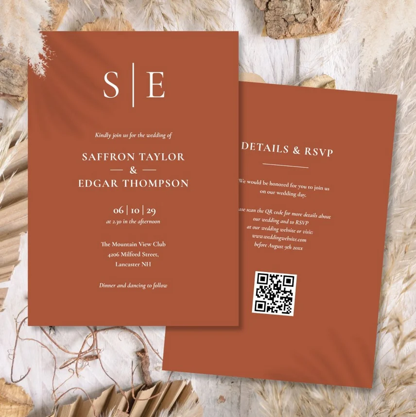
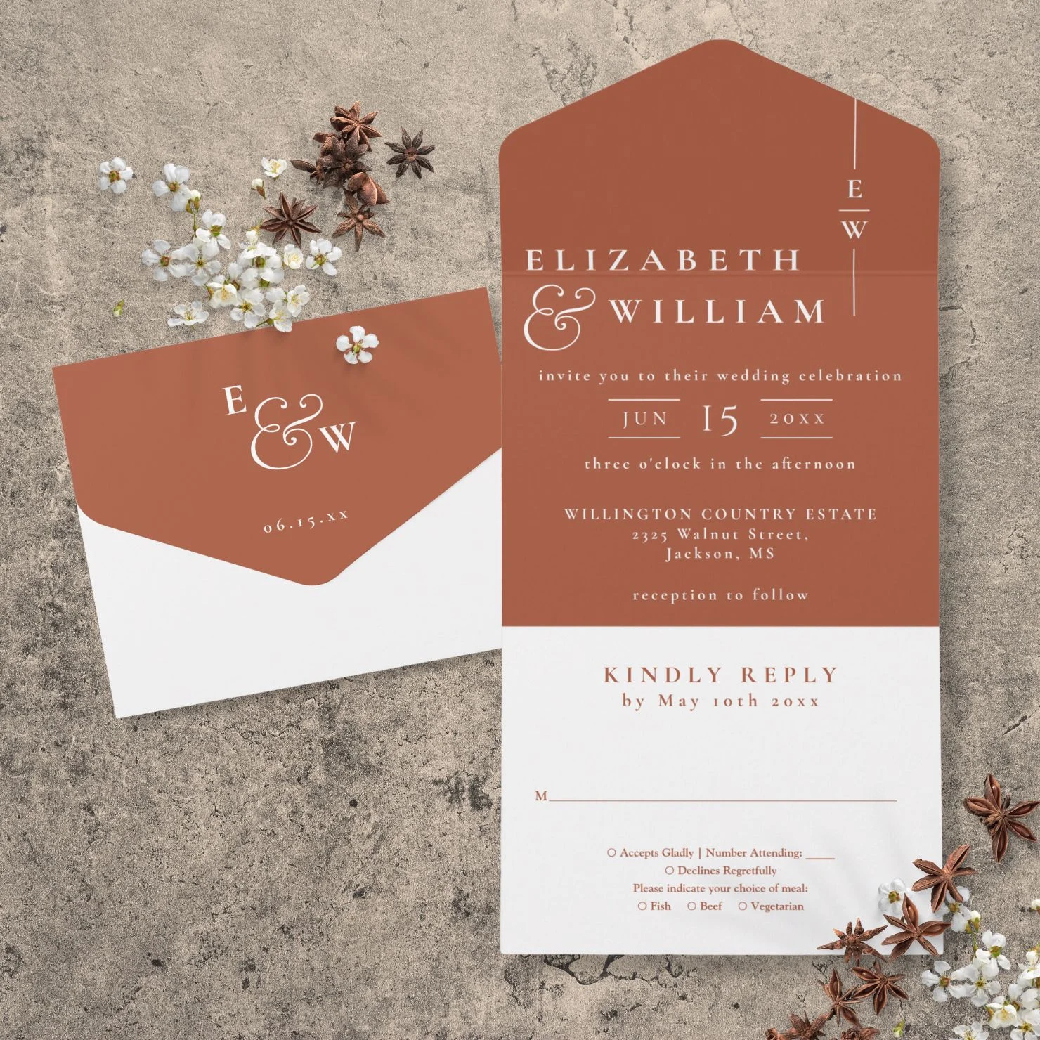
Monograms in white, cream, or metallic inks become focal points against the terracotta paper. The warm background adds gravitas to these personal symbols, whether they’re rendered in a simple modern style or with ornate traditional details. The contrast creates a striking emblem that appears to be emerging from the earth itself.
6. String Light Illustrations
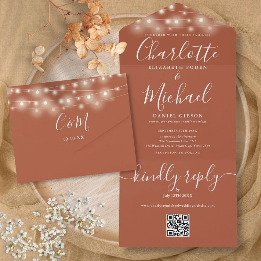

Delicate white or metallic string light illustrations create magical effects against the terracotta background. The warm paper makes the illustrated lights appear to glow even more brilliantly, creating a sense of enchantment and celebration. This technique works particularly well when combined with subtle floral elements or geometric patterns.
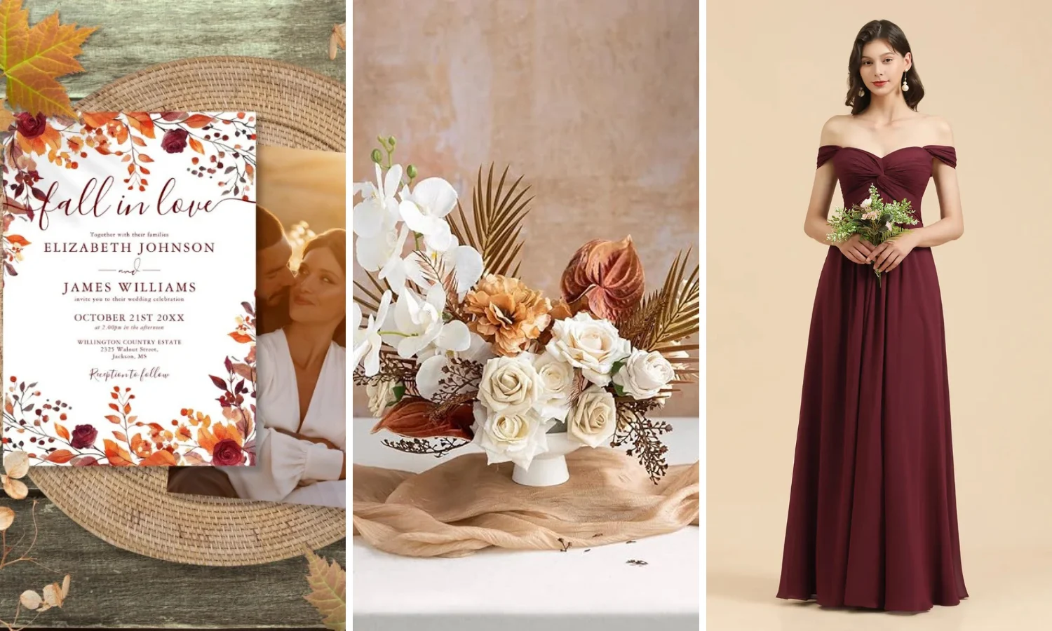
7. Autumn Fall Motifs
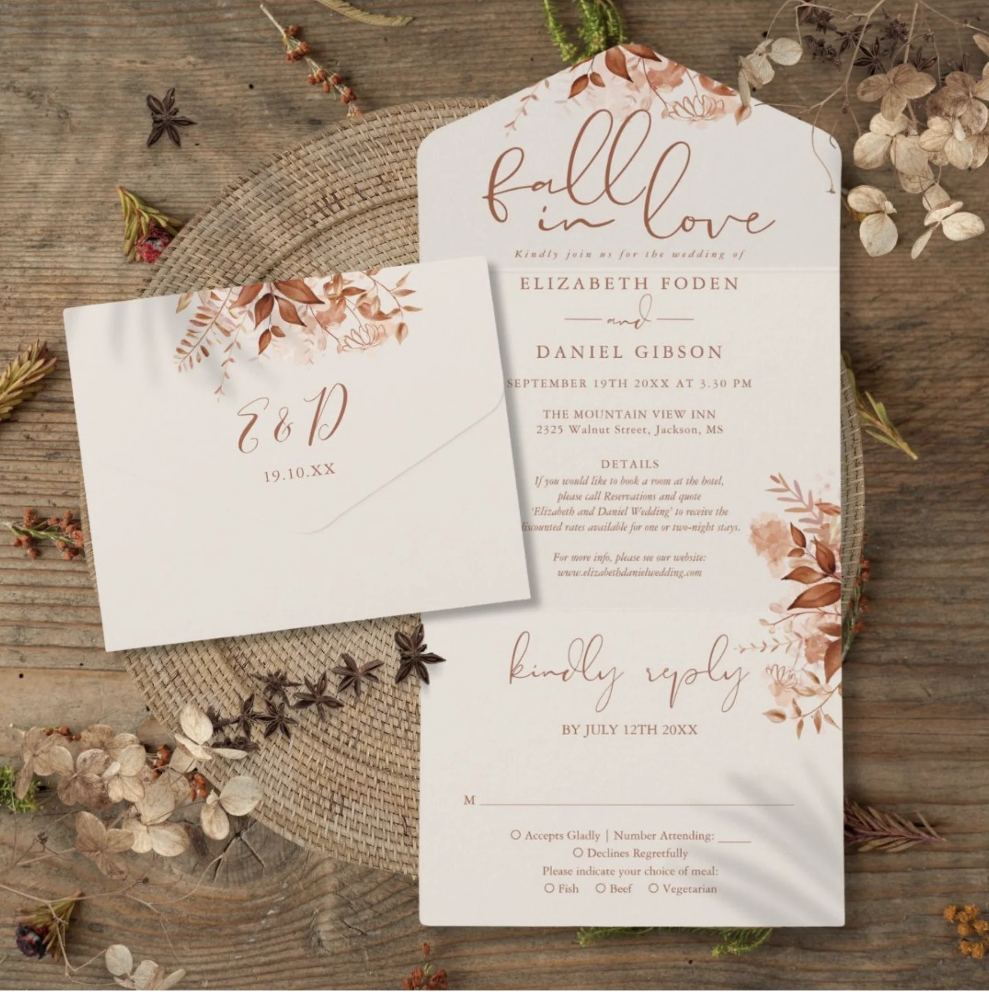
Autumnal designs take on enhanced beauty against the terracotta backdrop, creating a natural celebration of the season. The terracotta background naturally complements these harvest elements, creating a cohesive, sophisticated, and seasonally appropriate design. When combined with sprigs of dried wheat or pressed autumn leaves, these designs create multi-dimensional invitations that capture the essence of fall while maintaining elegant refinement.
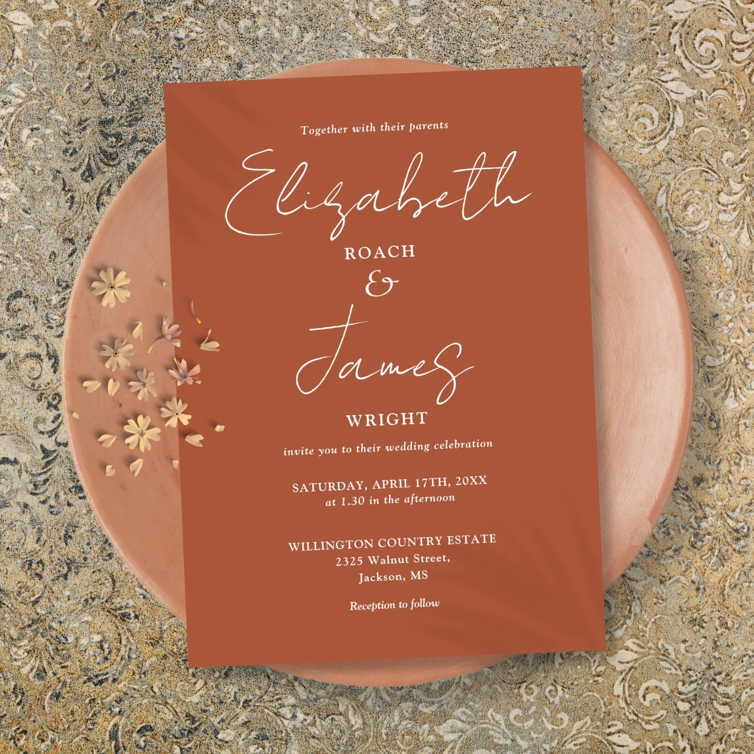
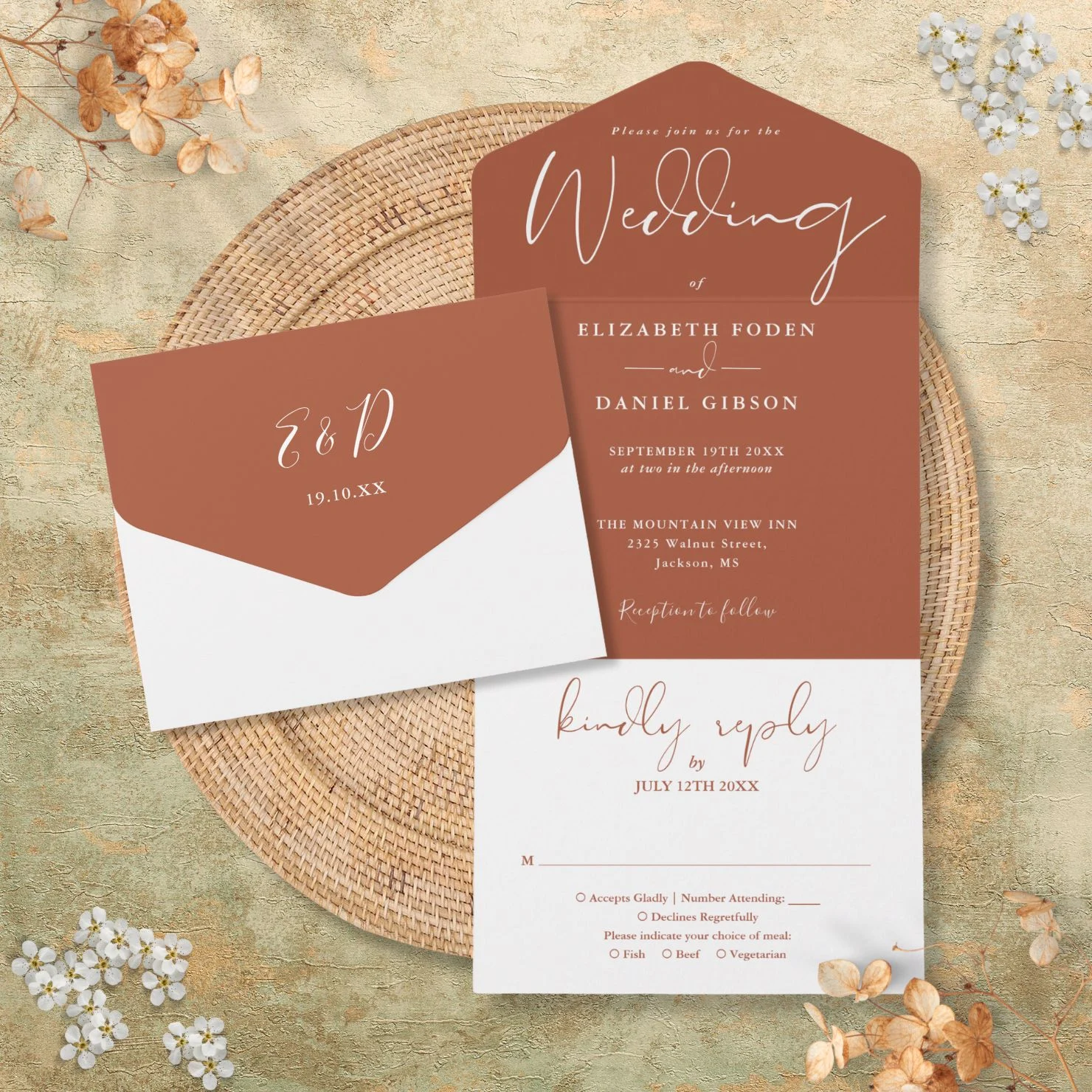
8. Romantic Script
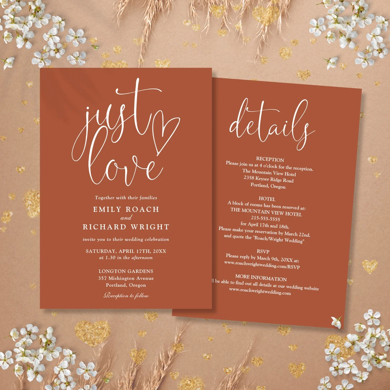
Flowing romantic script in light inks appears to float across the terracotta surface, creating an intimate and inviting effect. The warm background adds depth to every swooping line and flourish, while metallic or white inks ensure perfect readability and elegance. This style feels particularly personal and heartfelt against the natural paper color.
Creating Your Complete Suite
Finishing Touches
When working with terracotta paper as your base, consider these key elements:
Paper Selection
Choose terracotta papers with different textures to add interest across your suite. Handmade papers provide beautiful, natural variation, while smooth stocks offer clean sophistication. Consider mixing terracotta papers of slightly different shades to create subtle depth throughout your suite.
Ink Choices
- White ink provides dramatic contrast
- Metallic copper and gold complement the warm base
- Cream creates subtle sophistication
- Dark brown offers earthy elegance
Finishing Elements
- Deckled edges highlight the natural paper quality
- White wax seals pop against the terracotta background
- Vellum overlays create lovely layered effects
- Silk ribbon in complementary earth tones
- Gold or copper edge painting
Remember that terracotta paper naturally brings warmth and character to your stationery. Let the beautiful base color guide your design choices, using it as an integral part of your overall aesthetic rather than just a background element. When thoughtfully designed, these pieces will create a wedding suite that feels both grounded and sophisticated, perfect for couples seeking natural elegance with a modern twist.
Thisisnotme Designs
Thisisnotme Designs is a creative studio producing fresh, modern stationery and gift designs for life’s special events.
We love sharing our designs, fresh ideas, and inspiration to help make special days even more special and memories more memorable.
For even more inspiration and ideas, visit our stores:
ZAZZLE
Thisisnotme Designs
Pure Piglet Designs